
My Website Building Journey
Table of Contents
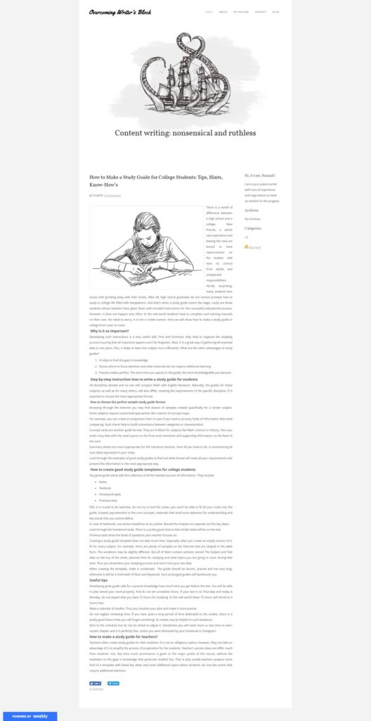
Any professional must have an advertising card on the Internet, be it a company account on Facebook, a landing page or a portfolio website. I am a copywriter, and the idea of a personal website haunted me for a while.
Browsing through the Internet, I looked through at least thirty portfolio sites of the great copywriters. Gosh, they looked amazing: informative, catching, in style. Why can’t I be as good as them?
With this visual experience in mind, I started to define the necessary parts of my future website:
- A blog section
- A contact form
- A place where I can attach my resume
My choices are explainable: I can spread the word on how to boost writing skills, and a blog is a convenient way to hand on wisdom to the progeny.
A contact form is a direct road to communicate with future clients.
Some people do not trust the quality of the presented examples but have an inconceivable trust to diplomas and years of experience in the sphere. So I have no choice but to add a resume there.
The price became a real stumbling block. After some research, I found out that a website crafted by a professional web designer will cost around $5,000. A website created on the basis of a free template by a drag-and-drop web builder will cost me nothing as I will do everything single-handed.
Poetic note:
I am an advanced user of the Internet and PC. I’ve seen thousands of websites and can tell a good site from a bad one. However, I have never tried to make one by myself and my knowledge of coding comes down to HTML’s Hello world! in the Notepad and this is my limit. Luckily for me, there are at least five website builders that promise such newbies like me a possibility to create a website in literally minutes with no line of code.
After many searches I’ve chosen these five web builders as the means for creating my website:
- GoDaddy Website Builder
- Wix
- Ucraft
- Weebly
- Constant Contact
Yes, there is no WordPress in the list. Are you surprised? As for me, I am more than surprised! Yet, this is my deliberate decision: I want to prove myself that I am able to cope with the unknown tools and, perhaps, find a new name in the web building sphere.
I am going to spend no more than three hours on one website builder to find out whether it is possible to make a site within such a limited time. Many such services claim that one hour is more than enough to complete this task, so, as you can see, I give odds to them.
Poetic note#2:
I have an ace up my sleeve: I know many web developers who can rescue me if I end up in a deadlock when making the site. I do not want to use their help as I do not want my site to be spoiled by professional interjections. This is ‘my precious’, after all. So in the case, if I ask them for assistance, I can proudly say that this web builder is not intended for use by novice, no matter what is written in the guideline.
Before making any website building efforts, I came up with the name, some articles to add in the blog section and the pictures to accompany them. Thus, all time dedicated to the construction of the site will be dedicated t to the work with website builder only; I will not waste my time searching for needed information during those three hours.
Day 1. GoDaddy Website Builder
GoDaddy met me with a pleasant promise to make a website in under an hour. Sounds more than appropriate to me! It’s 11.15 a.m. and I am about to start. The countdown has begun!
There is no need to create an account if you have a Facebook account. I signed in and immediately appeared in the GoCentral web builder page (why GoCentral, if the platform is called GoDaddy, btw?).
It is clear right off the bat that GoDaddy is something more than a website builder. It is a platform that offers you everything and even more to be successful and a good website is only a part of it. I’ve looked through the possibilities of the Dashboard and I was impressed. You can:
- launch marketing campaignsWix
- monitor connectionsWeebly
- look through possible SEO improvements
- add more payment possibilities
- work with social media
and much more. But enough background info, let’s go back to work.
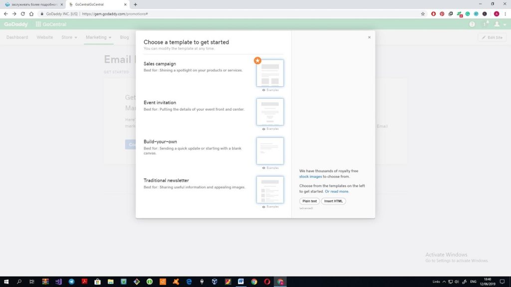
Working with a template
I’ve chosen a Writer industry on the right panel and the site instantly offered me a nasty looking theme with a draft name Perfect Nails, Island BBQ. No, thank you very much, this is not the thing I was looking for.
There are only twenty themes to choose from (starting to regret the decision to cross WP out).
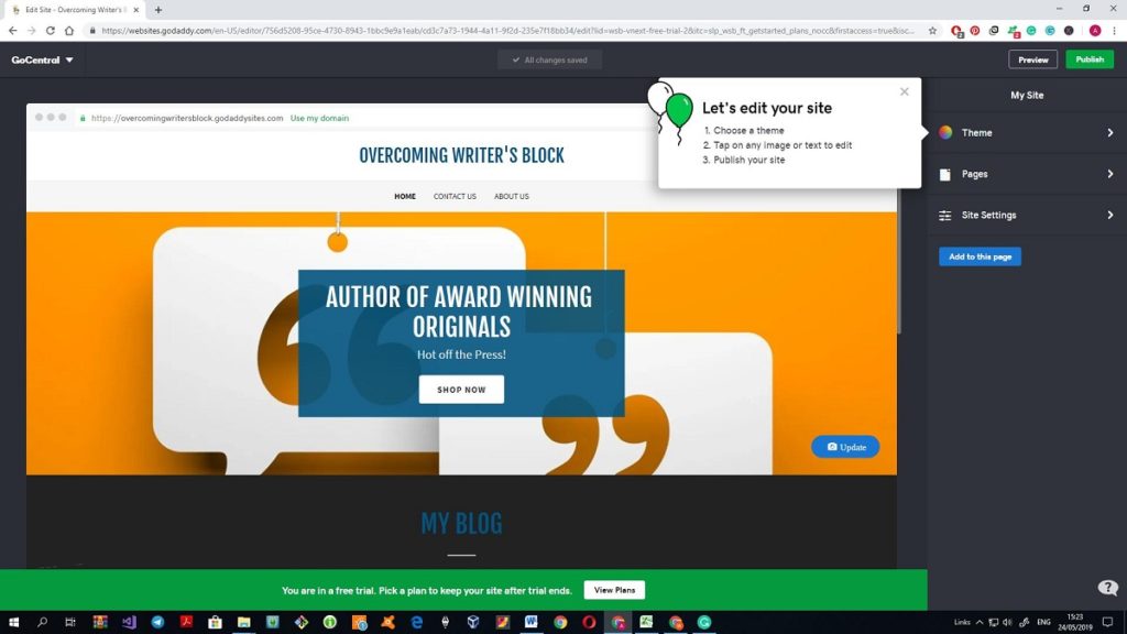
So, the theme is chosen and after some pointless clicks, I’ve found the possibility to change that dreadful orange logo.
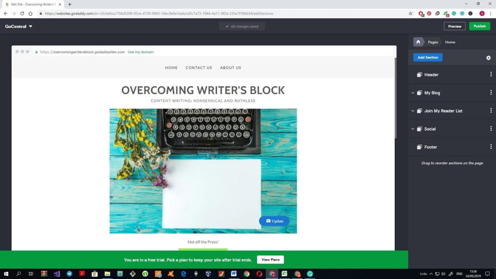
Unfortunately, there was only one prompt (that one with two balloons). After that, all my actions are made on an intuitive basis and now I’m simply wasting time clicking through all buttons and sections to see what are the possibilities of GoDaddy (aka GoCentral) web builder. In defense of it, I can say that so far, so good, I puzzled out how to add new pages, change and add new sections.
I am confident that I will be able to stuff all the desired pages and sections to the website of mine, but, trust me, that won’t take less than two or three hours. What did you say about less than an hour, GoDaddy?
One big disappointment for now: there is no possibility to place a text on a cover image. Of course, I can make a picture with an inscription with the help of Photoshop or any other picture editor. But it is really inconvenient to remake the image every time when I need to change the text on it.
Another disadvantage is the absence of the slider. There are so many great sites where all necessary information is presented in the form of the slides at the top of the page and I hoped to create something like that on my own website. Maybe, there are paid themes or widgets but the free theme has nothing of that.
Meeting glitches
When I started to fill in the blog section with content, the builder started to glitch. For example, I tried to delete a letter in one word, but it was erased from the other. Once I was kicked from the word processor, yet, luckily for me, the draft changes were saved. I suppose that the text editor conflicted with my Grammarly add-on, but I can’t switch it off, I have to make sure that my writing is error-free.
The functionality of the text editor slims to none. You can put in bold or italic type, make a bullet or numbered list, make a hyperlink, and make a sub-heading aka H2. I haven’t found a way to change the font or its size. On the one hand, you are protected from the desire to express yourself using twelve fonts in five sizes (trust me, I’ve seen such on the Internet). On the other, I needed some h3 to structure the text, yet, I wean myself by putting the text in bold.
A blog is stripped down. When you look at it for the first time everything seems to be fine, however, then you understand that there is no comment section or a possibility to evaluate the text with Like or Dislike.
When I was working on the About me section, this happened:
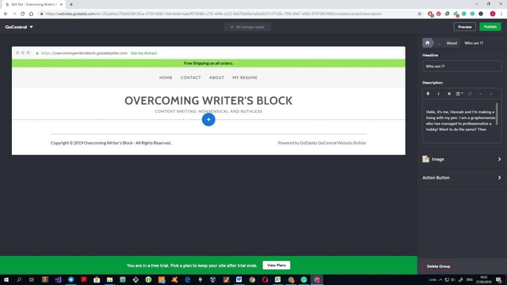
All content on the page disappeared though I could see the lead-in text on the right side of the page. And then this happened:
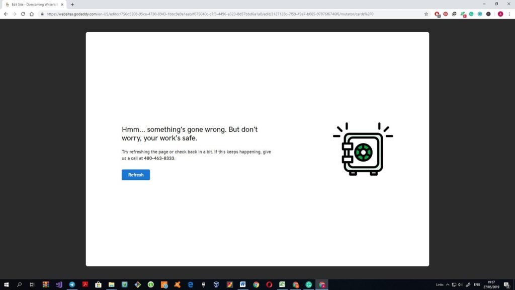
Once refreshed, the page editor worked as it should, still, I was quite nervous after making any change to it.
The Contact section was so good, actually, that I haven’t changed it at all apart from adding a link to my Facebook and LinkedIn profile. I know that one of the signs of the website’s credibility is the physical address of the company, and the site offers a map to point it out. What is a bit disappointing, there is no possibility to enter a Skype properly. I mean, you can manually add the name of the account or a phone number, but, there is no icon of a phone call or Skype. I understand that I nitpick; however, these small details often make all the difference. Besides, the Social section also does not include Skype. Speaking of the details: there is a possibility to choose a favicon for the site.
What about services?
I know that it is quite challenging to make a website mobile-friendly, especially when the site was created before the era of smartphones. So, at first, I was worried about the compatibility of the website. However, I am pleasantly surprised by the fact that you can look through both versions: a desktop and a mobile one.
There are really many additional features that I didn’t plan to add to my site. However, after I tried them, I liked them. So they will stay in the final version of the website. For example, I’ve added a Review section and the links to my social media.
I had no intention to add an online shop to the site as I was not going to sell my works. However, I’ve checked the offered solution to find out what is proposed and was impressed by the quality of it. Apart from common functions the site offers a possibility to feature the products on Amazon, eBay, and other popular platforms. The online shop features here include the creation of the Facebook page for the store, the preparation of the Grand Sales email and improvement of the site in terms of SEO. Naturally, the builder won’t offer you a whole SEO audit. However, adding a meta description and meta title of the site with the chosen keywords is the first and crucial step to SEO efficiency. All in all, I won’t add a shop section to my site, as the E-commerce plan is the most expensive in the list of subscriptions of GoDaddy and would cost me more than $300 per year. (Me from the future: GoDaddy’s instructions on how to improve the meta to be more SEO-efficient are still my star to steer by after testing all five website builders).
After I’ve added a shop section, the whole theme changed a little bit. For example, the list of features of the Subscribe section has been joined by the coupon for new subscribers with a possibility to choose the percentage of the discount.
The Subscribe section deserves a couple more words. Here, apart from the standard combination Button + Call-to-action, you can edit the responding email. The service offers several well-thought-out templates with a video explanation of why it is important and how to get the most of it.
Yes, I’ve ditched an idea of the online shop on this site, however, in the list of proposed sections I’ve found the one called “Restaurant Online Ordering”. I thought it would be great to make an order form on the site so people could order a custom paper by placing an order. Unfortunately for me, this section is the one connected to ChowNow so, obviously, it works with the restaurants that have ChowNow’s ID only. This order form cannot be customized and I didn’t find anything like that in the other offered sections. Too bad, the idea still seems great to me, so who knows, maybe I will find something like this at the other website builders.
To sum up
I’ve spent around three hours on the creation of my website. However, it is clear to me now that with enough experience and with all the materials prepared beforehand I could meet a one hour schedule. Yes, my website is quite plain and simple, yet, it contains all the necessary information about me and my work, so what’s not to love? Yes, it is not as fancy as many custom sites, yet, it is much better than thousands of websites made from free templates. I don’t think that additional fonts could help me to express my personality, but I am confident that the font used in the theme is readable on all browsers and mobile devices. I wish I could choose from more templates, still, the one that I’ve selected totally meets my requirements and aesthetic sensitivity, so no complaints there.
GoDaddy didn’t let me down, so the myth that only pro web developers can create good websites is 100% busted. I would say that GoDaddy deserves 8.5/10 rate because of some glitches during the process and too simple text editor.
Still, my quest is not over yet, as there are several more website builders waiting for my attention. Who knows, maybe one of them will exceed my expectations even more than GoDaddy did!
Day 2. Wix Website Builder
It is day 2 of the quest to my perfect portfolio website. In the beginning, I was quite skeptical about the very possibility of a great website made by a novice. To me, all such DIY websites looked identical. However, the first attempt proved to me that it was possible to make a top-notch website with plenty of useful features within a couple of hours with no code line.
Now I can proudly say that I have some experience in web building so, in theory, my work with Wix should be easier and quicker than with GoDaddy (Spoiler alert: I was wrong). Still, I will not back off from the plan to dedicate three hours for work on the website.
There is a possibility that I will sound quite biased in the comparisons of these two builders because I actually liked the result of the joint efforts of me and GoDaddy. But I’ll bend every effort to be as objective as possible.
The very start of work with Wix bamboozled me so I had to make additional research on what way of website building to choose. It seems that Wix decided to step back from the classic template path and created an ADI aka Artificial Design Intelligence. As I see it, the AI of the platform will create a website for me based on my answers to the series of questions. Will I be able to adjust the result? Will I like the design proposed to me by a machine? Honestly speaking, it seems like a variant for people in a hurry who do not want to bother themselves with proper editing. However, judging from the previous experience I will need no more than a couple of hours to complete the template-based website, so I can spare some time on this way of creating webpages.
Wix website #1.
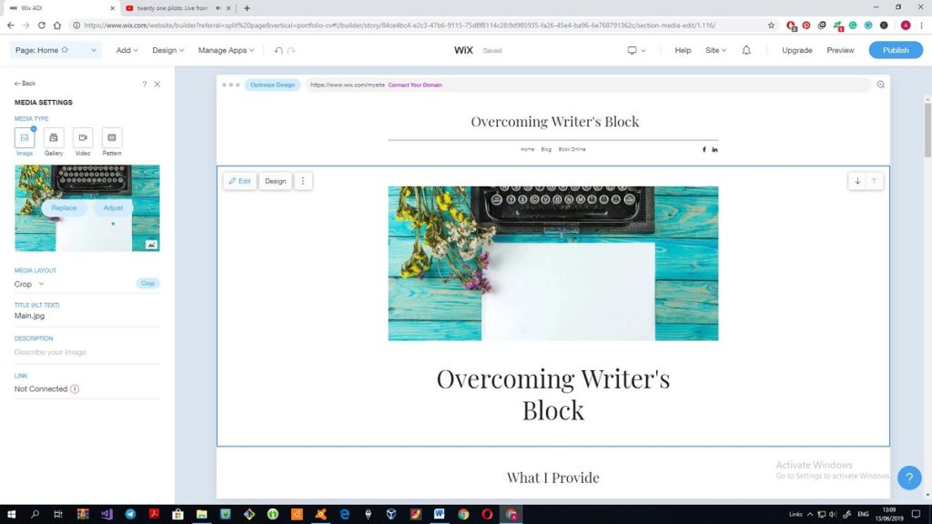
The platform has offered me three templates based on my answers. Quite limited range of choices, isn’t it?
Believe it or not, I liked it. The first thing that comes into mind is that the offered template is more sophisticated.
However, now I start to regret that Wix is my second, not the fifth or even the tenth web builder. There are too many features to choose from that I start to feel that I need to spend more time browsing through the features than I expected. Help section won’t help much: there are 17 tours and more than 20 articles there so if I will start reading them I’ll have no time for a website.
Still, I would like to choose a theme on my own, so I’ll switch to the Wix Editor mode.
Wix site #2
…and now I’m seriously worried about the prosperity of this undertaking. Wix justifies the title “drag-and-drop” editor to the max, so you can literally put anything anywhere on the page. The guides help to make this process more organized, however, at first, the attempt to add a heading to a section was quite challenging. I regret my decision to choose ADI for the first attempt to create a site because the Editor mode was applied to the template that the ADI offered me, so I had no possibility to choose a template on my own. Or, to be blunt, I was able to start a site from scratch, but I’ve already made several changes to the template so I didn’t want to waste more time as I won’t be able to finish work in time. For example, I’ve spent 15 minutes to find a font for the heading that matches the previous version. My contrition for a lack of fonts at GoDaddy backfired, yes.
Working with a template
I’ve decided to repeat the design of the first template in the Wix version. It is another challenge for me to prove that it is possible to achieve the same result using different tools. At the moment I see that it will be tough despite the fact that the first version of the site is quite plain. The point is, Wix is overcrowded with features and add-ons. You have to browse through all tabs to find the necessary section, and all tabs have submenus, you got it.
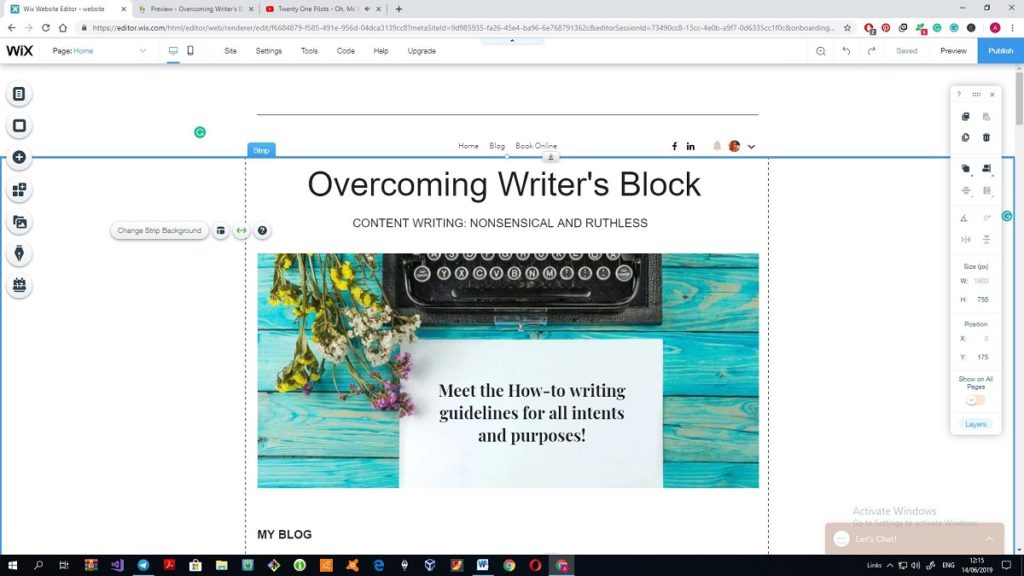
So I placed the blog section right after the logo image following the previous template. Wix’s blog section pins down all similar sections in other website builders right off the bat. It is possible to see the number of views, comment an article, evaluate it and share it over social media.
The text editor of the builder has a limited set of features, however, here you can at least adjust the intervals between lines or set h2-h3 headings.
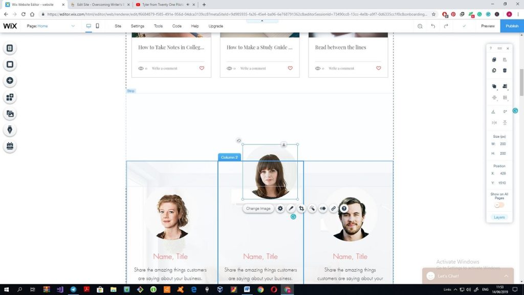
The template offers many pictures with notations and a quote that I do not need. So I’ve deleted it and manually lifted up the Reviews section. This problem was quite frequent:
It is hard to select all objects and level up the whole section as each time you click somewhere on the screen you pick out a strip or section.
In addition, the first version of the site repeated the name of the site at the top and right after the menu bar. After the removal of the top heading an empty space appeared and I have no idea how to change the size of the header, although I have looked through all the proposed tools. The same problem is with the removed images and quotes. The page now has a huge white space and no prompts on how to fix it if I do not want to box up the site with all possible features.
In the meantime, I’m more than sure that Wix Editor is too complicated for me. I’ve spent almost two hours on the creation of the site that at the moment looks like the Frankenstein’s monster and the only thing that inhibits me from deleting it to stop its suffering is a resolution to dedicate three hours to it.
What’s on the good side: I’ve found a slider and added it to my About page. From this perspective, Wix seems to be really generous as not many website builders offer this feature in free templates. And besides, Wix offers loads of features and add-ons, so it seems that everything I needed there can be found here. But, unfortunately, I still cannot figure out how to apply this to practice properly.
Thus, I quickly added two needed pages: About and Review and then spent 15 minutes on how to add a PDF file to the page. Still, it is impossible to download the file from the site, it is just a way to add a PDF file to the page.
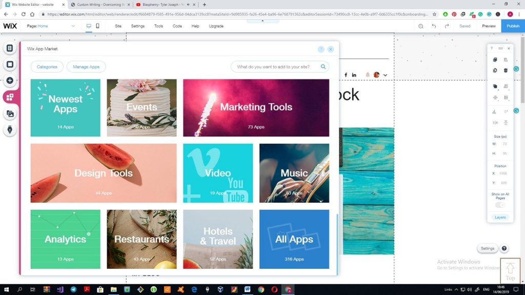
The Wix App Market is impressive. It offers more than 300 applications and more than a hundred of them is completely free. During the time when I was making the site the number of applications increased, so it is clear that soon it will be packed with great packs even more.
There I found a PDF viewer to add a PDF file with my resume as well as many other useful apps. I do not see a need in them in my site, however, it is great that there are so many apps that can improve the quality of the site. Still, I yielded to temptation and added Google AdSense to the website and a search through a site. I’ve found many more apps that will potentially appear on my site as they help with the analytics, better management of social media, better contact form and other, more customized and customizable forms. I will not add them now because I have no time to find out what app is the best and how it works, yet, there is a pretty good chance that I’ll return to it in future.
Also, I flinched a bit more from the previous template and added the Upcoming events section and a Back to top button.
And that’s the finish of my work with Wix as three hours have passed.
I managed to clear away the huge empty space in the middle of the page, it took more time than I expected. Still, the non-adjustable size of the header and footer is my new headache. I could not find the place where it was possible to change the height of the footer but I failed. There is a Size in the right-side toolbar, however, it is impossible to specify new dimensions.
I’ve tried to add a background image to the page, didn’t like it but could not undo the adjustment. The only solution I came up with was selecting the lightest and transparent picture from the proposed.
Mobile version of the website deserves a couple more words. It is awful. As much as I was pleased with GoDaddy’s mobile adaptation of the site, as much I dislike the variant that Wix proposes. First and foremost, you have to adjust the view of the site single-handed, so it would take another hour. Thus, you have to change the font size or adjust the text area to be sure that the text looks fine and nothing is hidden or exceeds the bounds of the field.
In addition, some sections look just not right, for example, the Review section is shown completely with one review on the whole screen.
Afterthoughts
My opinion about Wix is ambivalent. Am I satisfied with the quality and appearance of my site? Not at all. Is it a website builder for newbies? To some extent. Yes, indeed, Wix allows a user to create a website without coding. However, the freedom it offers is overwhelming. You’ll need some skills and experience to be able to create the site that totally corresponds to your needs as there are too many add-ons, features, and tools to use. More than that, it is hard to fight the temptation to add all possible features to the site.
A newbie like me has to content oneself with a site created by an ADI. I have to admit that such sites look great and take literally minutes to create so all you have to do is to change the title and add necessary photos and texts. But ADI site is difficult to adjust. So, if you want a more customized site, switch to the Editor mode and welcome to hell for newbies. Working with GoDaddy was 100% easier as you could add entire sections with subheadings and change them easily. Here the Editor mode has much more well-rounded functionality, yet, you have to add subheadings manually and try to hit the mark precisely. Of course, the guides help a lot, still, I wasted a lot of time trying to place the text blocks where needed.
The builder does not glitch, and all the features are more elaborate. Wix definitely meets and exceeds all my expectations in terms of add-ons. Most of those features can be found only in the paid templates of the other builders. But, only a savvy user can get the most of it.
I am certain that a novice won’t be able to create a fully-fledged website that utilizes all the possibilities that Wix has to offer. However, if to show the toolset and the additional apps to any pro developers, I’m more than sure that they will be impressed. So if you want to utilize Wix for your web ambitions then:
- Plan in advance what you want to see on your site
- Practice a bit on other website builders
Plan in advance what you want to see on your site
My one-time web building experience appeared to be insufficient in front of the Wix’s opportunities, mind that.
On the whole, I am more satisfied than disappointed. It is obvious that the first edition of the site will be deleted as soon as I finish this quest. However, with a bit of experience, I will try to use Wix for the creation of a great website. And taking into consideration the number of available features, I’m more than sure that the result will astonish me.
Day 3. Ucraft Website Builder
This is the third day of my web building attempts to create a solid personal/portfolio site. My Wix experience was quite telling for me so it is possible to say that I am still a novice in website building.
Ucraft is not so popular, yet, a promising builder that offers a wide range of features to the user. So, I hope that the final result of my work will not disappoint me as it was with Wix variant.
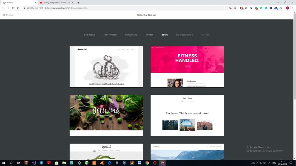
The settings are the same: three hours timeframe for the work on the website. At first, I wanted to repeat the previous design, however, when I saw the proposed templates I had to abandon the idea. The number of templates in all categories is hundred at most, as there are only nine categories with ten templates on average.
At first, I was bold enough to choose an empty template and tried to repeat the first design. However, everything that seemed so simple on the video course, appeared to be a bit complicated in reality. Still, here much prominence is given to the assistance for a novice. Each category or tool has the visuals so it is possible to figure out how to use it. Unluckily for me, the limited timeframe didn’t allow me to get the most out of the guideline so I had to sort everything out on my own.
There are not so many templates, and some of them do not make sense, as for me. For example, who would like to use a template of a site dedicated to the life of Carl Lagerfeld? I mean, as a sample of a website that can be created using Ucraft it would work brilliantly, but, as a template?
I didn’t find anything close to the websites that were created on Wix and GoDaddy, so it was necessary to start the work from scratch. I’ve selected the template that was the closest to my desired content and started working.
The insight into a builder
When you start working with Ucraft, Dashboard is the thing that requires your attention. Here you can find all the tools that the builder offers, starting from the Designer tools to SEO.
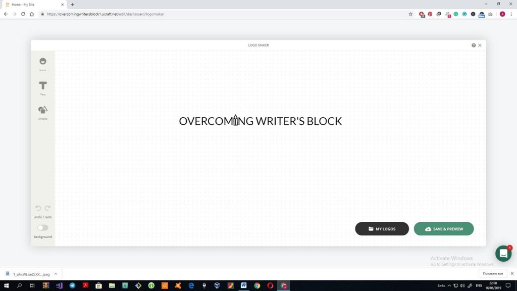
The first thing that met my eye was this logo maker. Using three simple tools I’ve managed to create a cute logo for the site and, after I saved it, it immediately appeared on the top left corner of the site. I do not remember if there is something like this in the previous website builders.
SEO section also grabbed my attention at once. I wanted to compare it with the SEO settings of the previous website builders. All pages were signed with red screamers on the top signalizing that there is a problem with SEO. The settings in this section allow the user to add a name, meta description, and image to the page. I still cannot understand why here much prominence is given to the image but all keywords are neglected. In this battle, GoDaddy clocks Ucraft clean.
Another great feature of the web builder is a possibility to make a Multilanguage site. However, I still cannot figure out how it is supposed to work. When I added another language, the site has shown no signs of it: no icon or a flag, or a button. Maybe I must add translations manually in the table Transcriptions in the Dashboard? Should I write entire blog articles in the other language?
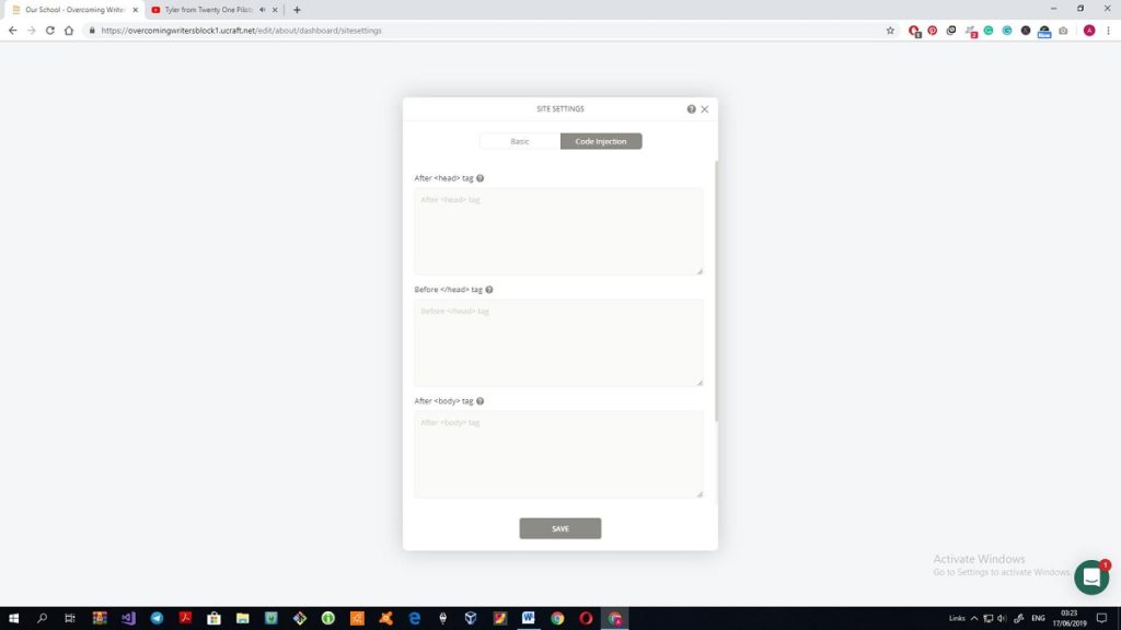
Browsing through the Site Settings in the Dashboard I’ve found a shortcut for the code-savvy users how to improve the site with help of HTML code so here coding adepts have some preferences.
The tool that I definitely like is Designer Tools. With the help of this tool, it is possible to customize the style of all types of headings and texts in advance so there is no need to edit them during the creation of the site. Also, you can change the buttons and layout of the site.
Working with the template
During my work with the template, I faced several difficulties. I remade the very beginning of the site for at least four times as the Undo button doesn’t work as it should and the whole block can disappear within a second because of one click of a mouse. I’m literally afraid to drag and drop the item on the screen: one clumsy move and the whole structure of the top of the page is broken immediately.
It is impossible to place the text or title anywhere on the logo image apart from the place specified by the template. I tried to change the position of the text, yet, it ended up with deleting of the whole block so I risk no more.
The next thing that made me nervous is the appearance of three “deleted” blocks when I was editing the next section of the page.
And this is my attempt to delete a page that I didn’t need:
After that, I was transferred to the main page of the site and it appeared to be already published(?). There is no admin panel or something like that, so in order to return to the editing mode I added /edit to the address bar and it worked out.
Another inconvenience: there are no pop-overs. For example, like any other self-respecting website builder, Ucraft offers many blocks and elements that can be drag-and-dropped on the page. However, the preview of the elements is so small that you can only guess what it is and what’s in there. On the positive side, there are many such blocks, so you can find the most appropriate for you. For example, the first Testimonials block looked really pathetic, there was only a tiny photo on a wide strip with no text area. But after spending another 15 minutes for browsing through the proposed elements I’ve found a good-looking one. Still, all these blocks are just parts of the offered templates, they have a different style. So there is a pretty good chance that you will combine the uncombinable.
What’s convenient: the adjustment of the height of the block is as simple as ABC. After the struggles with Wix, this feature definitely to the advantage of Ucraft.
The Subscribe section is one of the built-in elements of the builder and looks awkward. I tried to find the replacement in the Blocks section but didn’t find an alternative. Then I tried to create a combination A subscribe button + a field and failed. The point is, the built-in subscribe button has all necessary settings, so you can select the email where the notifications will be sent. If you create a custom button choosing from six proposed styles that do not differ a lot, there is no possibility to apply the required settings.
I’ve also caught a couple more bugs. For example, when I created a My Resume page in the Dashboard and tried to edit it, the 404 error appeared and once again I was kicked to the published site, so I had to repeat my /edit action. And, alas, this section will remain empty, as the builder is neither able to add files nor you can upload the file from the page. If to compare it with other builders, GoDaddy enables uploading from the page and Wix has a PDF viewer app that allows adding a PDF file to the page.
The text editor here is the most elaborate, so far, so good. You can add tables, different types of headings, quotes, images and adjust the font size. There are only nine fonts available, but after a hundred of Wix’s fonts I start to think that it is an advantage. The blog section that utilized all the possibilities of the text editor is not that elaborate: you cannot leave comments or share the article over social media.
The toolbar in detail
Using the left-side toolbar a user can change the colours utilized in the site, add basic elements, blocks, apply different effects to the items on the page and check the progress.
The Blocks section includes all customized blocks that can be added to the page. It is rather inconvenient: there are no categories of blocks, no search through the blocks and the previews are tiny. Even though my monitor is quite large, I still could only guess what is placed in the block.
A progress bar shows how many tools and features you have used when creating the site. I didn’t use them all because I didn’t need it, still, someone may find it helpful. Still, I thought to the utmost that it was my progress in work with the pages.
The Elements section is categorized so it is much easier to use rather than the Blocks. The basic elements include a button, image, and slider, title and text, video, icon or logo. There are several built-in forms like Subscribe or Contact form, as well as navigation tools.
Those who want to create an online shop can utilize all necessary options; a cart, categories of the products, single products and so on.
The Blog section helps to make blogs more structured. Thus, you can point out related articles or define article categories.
Integrations help to get the most out of social media. There are some blocks with a built-in social media integration, however, this section makes usage of social media more efficient.
Misc section is interesting as it proposes different goodies: a countdown, map, quotes and (sic!) custom HTML code. I suppose many users who know HTML can benefit from it and customize the site even more, however, my zero knowledge of HTML prevented me from this.
Preview of the site looks fine, everything is created automatically and it is possible to look through the tablet and mobile version.
To sum up:
Ucraft is a solid website builder that any novice can handle. I admit that many mistakes I’ve made were the result of my inobservance, however, the situation would be much better if the Undo function worked as it should. I cannot say that I am impressed by the number of add-ons and features (and I doubt if any website builder can beat Wix in this aspect), however, it is fully-fledged and has a great functional.
What’s good:
- Logo creator is great
- Designer tools are really convenient and time-saving
- The extensive set of tools
What’s bad:
- Too few templates
- Oversensitive blocks (any move can end up with the disappearance of the whole block)
- Undo function does not work
- Blocks are not categorized
- It is impossible to add files like PDF or .docx to the page
If to cavil about minor points:
- You can navigate through the pages by the Dashboard only
- The Dashboard does not depict the real view of the pages
- Built-in elements are ham-fisted and it is hard to customize them properly
- There is only one Subscribe element in the builder
- SEO features are minimal
If to compare all three website builders, then Ucraft would be somewhere in the middle. It is safe to say that Ucraft meets all the requirements of a newbie. This is a result of my work within around three hours. I’m sure that with some more time I would be able to get the most out of the possibilities of Ucraft, however, the view of the built-in Subscribe element makes me really sad. I hope that soon the situation will change, still, even now the builder is great and easy-to-use.
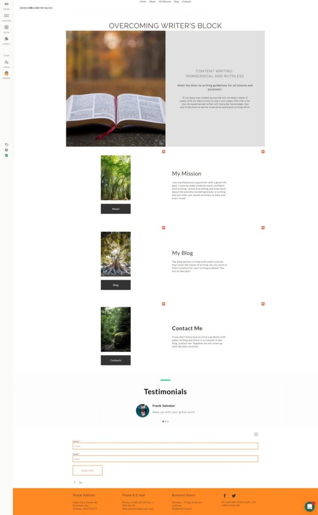
Day 4. Weebly Website Builder
So I’ve tried and tested three website builders. Every time I traced some disadvantages and I don’t have a perfect website still. The first was as easy to use as it was limited in the functionality. The second was so complicated that I will return to it only after at least a month of web building experience. However, I will definitely return to it as the possibilities there are almost unlimited. The third was not bad, however, it was not great either. Those built-in non-customizable elements stand out from any style. So my quest still continues.
The insight into the builder
Weebly met me with the standard choice between twenty templates in six categories. However, when I looked through the proposed themes it became clear that at least the half of the templates wandered from one category to another. Naturally, there was no possibility to find the template with the resembling design to my first designs. I’ve surfed through several templates and one caught my eye at once. Cthulhu Fhtagn!
I have to note that this theme is not as sophisticated as many others that can be found here, however, the heart wants what it wants.
First and foremost, I checked the settings of the site. SEO settings allow specifying the keywords of the website, as well as add a meta description, which is quite good.
All small additional details, like a favicon for the site, are on the dark aka Premium side of the builder, so if you want to personalize a website, be ready to pay for it.
Working with the template
OK, I’m already spoiled with the previous three web builders. Although it seems that there are so many fancy buttons placed on the right side toolbar, it becomes obvious that the functionality of the builder is quite limited.
For example, you cannot change the font of the title or the font of the text as you can use the font that is specified by the template. Also, it is impossible to select the necessary font size, all you can do is to click on “+” or “-” to adjust the size of the letters. It may be convenient for the newbies: if you have a possibility to choose from dozens of fonts you are at risk of turning your website into a circus. I am not confident in my designing skills and a sense of moderation, so I’m ok with that. After all, I liked this template and the fonts that were used in it.
You cannot create a logo, but, you can upload your own image, however, there is no tool that may help you to come up with a logo for your site.
Here is another example: there is no possibility to align the part of the text left or right. You can align the whole text only. Some features that should be placed in the text editor toolbar are propelled into the common toolbar on the left side of the page. Thus, the quote feature is there, although I searched for it when I edited the text and haven’t found it when I needed it.
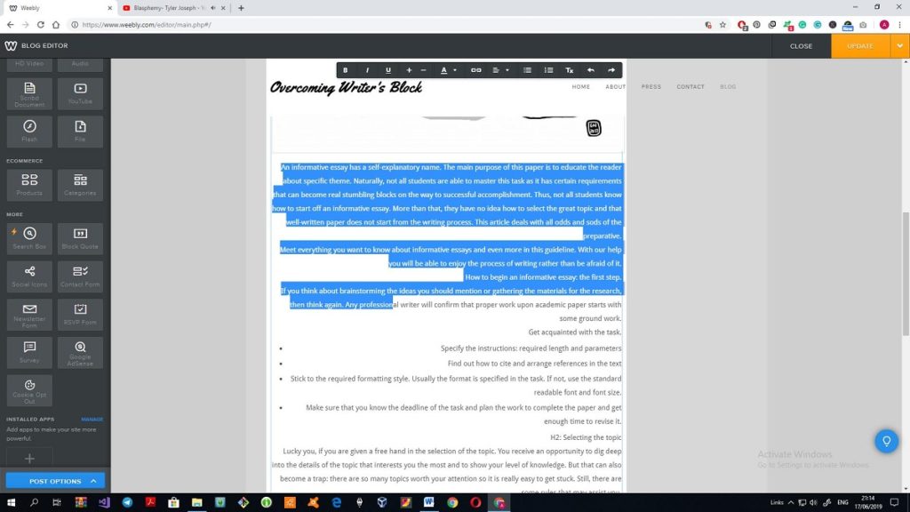
And this is the thing that I do not like at all. I’ve already added three blog articles to the site, however, the main page of the text keeps saying this:
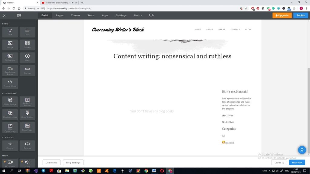
I hope that the situation will change as soon as I publish the site. However, if not, then what’s the point of such a blog template? Besides, adding a new article to the blog has a separate toolbar at the bottom of the page. It is rather inconvenient, as I searched for it for quite a long time and didn’t see it as it mingles with the footer of the site. (Spoiler alert: I published the site and no blog posts appeared on the main page of the site. The blog page has three articles already. I have no idea how to fix this).(Spoiler alert #2: the only blog article that has appeared on the main page is the one that was posted AFTER the site was published. All other articles are not even listed in the archive of the site).
What are the services of Weebly?
There are seven categories of tools and services that Weebly offers to the users:
- Basic
- Blog sidebar
- Structure
- Media
- E-commerce
- Apps
- More
Basic features are all about the content that appears on the site: using them, one can add text, image, slides, gallery, map, or code. Thus, Weebly enables knowledgeable users to stand out from the crowd. Does it seem a bit offensive to us, non-tech-savvy newbies? It may motivate people to get acquainted with some most frequent code lines, but, I am not ready for such deeds. By the way, I tried to upload the image from the database of the builder and I have to admit that free stock images at all the other builders head and shoulders above those images, mind that, if you want to use the images offered at Weebly.
Blog sidebar is a unique set of features that I haven’t seen at any other builder. The features there allow structuring the blogs, defining the author of the blogs, adding archive feature, etc.
The Structure section offers dividers and spacers in order to make the structure of the site less crowded. When you are on the pages other than a Blog page, another block called Structure appears in this section. Thus, you can drag and drop one of the five blocks each of which has 3-5 sample blocks. If to compare it with dozens of Wix’s or Ucraft’s additional blocks, it becomes clear that there is no room for a running jump of your creativity.
Media is a self-explanatory section that allows adding a YouTube video or a video file, audio files or other types of files. Flash got my attention: many browsers refused to use Flash because it compromised the security of the websites. Won’t it harm the rating of the site?
E-commerce is presented in the Products and Categories only.
The apps are, perhaps, the most interesting and efficient part of the whole builder. There are around 350 applications that can be installed on the site. Naturally, I didn’t add all of them, however, I zoned out in the app market for a while. To my regret, all SEO applications had only a free trial that switched to a paid version. What is great, the whole progress of the installation of the app requires two clicks, that’s all.
“More” covers specific features like blockquote or survey. I wanted to add a Search tab to the site, however, it appeared to be one of the Premium features that are added to the set of free tools. I wanted to thwart fate and add an app that would include a Search bar to my website, but I didn’t find one. Too bad, but, the site will operate perfectly without it.
I didn’t try out the templates of an online shop or a business template. They may be more functional, yet, my template was plain and simple, and, as a result, the website in a whole appeared to be quite laconic. But, if to be honest, I actually liked it. It has everything necessary for a self-respecting blog website, what’s not to love? What is interesting enough, there is no possibility to add something more than a main image, social media icons and the blog articles on the main page. The Structure section even hides the Structure element, so you cannot add a block to it. If you add an image or some other basic elements, the whole layout of the template breaks down. You cannot even add a subscription form as it is added somewhere in the middle of the main picture, so the title of the site hides somewhere. I assume that this is a kind of an anti-vandal functionality, so any novice will be able to infringe the entirety of the template.
To sum up:
The whole process took no more than an hour and a half to create the whole site. I have no idea what to do with the rest of the time of the 3-hours timeframe, actually. The functionality of Weebly is really limited, and the work with the template does not take much time. All your interactions are limited by the uploading of the new images, changing the text in the template and copy-pasting the texts of the blog articles. Of course, you may play with apps or select one of five blocks available, however, that also won’t take a lot of time (naturally, if you can recover self-possession and won’t add all 300 apps from the App Center to the website).
It was, perhaps, the easiest website I’ve created so far. And it is not because of its black and white scheme. There are so few possibilities to spoil (or improve) the site that if this website builder cannot be called a fool-proof, then I don’t know what builder can.
My main points of criticism are:
- A limited number of features
- Too few blocks to work with
- No Undo/Redo buttons
- A limited number of templates
- Strange position of many tools and features, like quotes of blogs
- No preview for the tablet/mobile version. Is it at least compatible with mobile devices?
Will I return to this site? No, why should I? Everything that I wanted is already there. All the rest that can boost the quality of the site is either paid or absent. However, if my teenage niece will come to me and as for advice where she can make a website on her own, I will definitely propose Weebly. It is really hard to spoil the template or change it too much, so it truly deserves the title of the website builder for the newbies. Weebly proves that it is possible to create a website within an hour. What is different about it is that you cannot name the result of your work as unique or completely personalized.
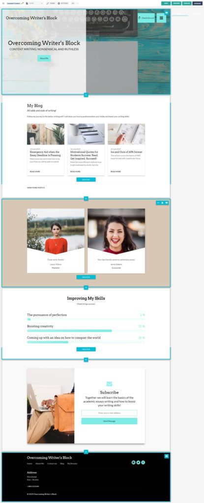
Day 5. Constant Contact Website Builder
I feel like I’m a spoilt child. One website builder is too complicated for me, the other is too simple. One glitches a lot, the other is too limited in terms of templates and features. Perfection knows no limits, right? Here is my anniversary fifth issue with Constant Contact website builder.
I remember how I was impressed by the Wix’s ADI that managed to craft a website within a minute based on the five answers about the sphere and purpose of the site. And the result of its efforts really caught my fancy. Constant Contact is the website builder that utilizes AI also. So I’ve decided to give another chance for artificial intelligence to impress me. Who knows, maybe the website created here will be the best one?
The insight into the builder
As with any other AI builder, everything starts with the questions. I specified the sphere of the website, uploaded a photo for the main image and choose a color scheme. There are 18 color schemes and none of them contain bright blue or red colors. You can choose only from five font types.
And here is the result of the AI’s work:
I have to admit that it looks more solid and fully-fledged than some of my attempts to create a website singlehanded. I will remove some sections, add some pages and place a couple of blog posts to try and test the preview of the blog here. Hope, that my actions won’t turn this template into another Frankenstein’s monster.
Working with a template
As you can see, there is no choice between templates so I have to take what comes to me. What is convenient, the very beginning of the work starts with a quick, but an informative tour around the website and its possibilities.
Traditional inconvenience: you can browse through the pages of the site only using the top toolbar of the builder. Well, at least, the Undo/Redo buttons work properly.
There are 27 types of sections that can be added to the template – some website builders can only dream about it! In addition to that, each offered block has several layouts so you can choose the most appropriate look and, thus, personalize the site to the max.
Traditionally, the blog section follows the main image of my websites. When I started adding a new blog post, for the first time in five text editors all formatting of the Word document was broken. Can you imagine fixing all paragraphs in the 1k-word text? The text editor has only six features: bold, italics, underline, h2, h3, quote, and hyperlink. Each and every blog has SEO settings. Comparing it with the number of offered settings and layouts, the functional of the blog posts is disappointing. It offers nothing, actually. You cannot share it over social media, rate or comment it. The preview does not show the statistics of views or comments either. It is obvious, that the templates that Constant Contact creates are not at all about blogs. The online shops are well-thought-out here, though, that’s a given!
All layouts of the Testimonials didn’t look right. It is impossible to change the size of the whole block, so it looked huge, especially, if to take into consideration the fact that the text there is minimal.
I found one section that I have never seen before: a progress section. There it is possible to define the progress of certain skill or goal so I snatched an opportunity to add it to my website. All the same, I was going to delete a couple of sections that were needless.
Another interesting story is the Timeline. Thus, you can tell the biography of your company with some milestones. I didn’t add it to the main page because
- It is huge
- It is impossible to change the size of the block
- Too many ideas about what to place there
Actually, there are plenty of unusual blocks that can be added to the website: countdown, upcoming events, FAQ, menu, points of interest, progress, statistics, etc. Tell you the truth, I could not overcome the temptation and spent quite a lot of time searching for catchy statistics dedicated to the problems with writing. Not all sections look great, so, I would rather use one well-thought-out block rather than three huge half-baked sections. And that is, by the way, one of the main issues of this builder. All sections are oversized, and if I had a chance to adjust the size of the blocks, I would do this immediately.
Working on the additional pages of the template
The standard Contacts page looks perfect (if not to take into consideration the size of its blocks). There is a great contact form, a map, links to social media, etc. The only thing I did was to change the intro text.
The Blog page has a preview of the latest articles and following the minimal visual style of the blog section, I didn’t add anything to that page.
As for the About me section, I tested some new blocks: USPs and Statistics. These three circles are the only items of the template with the adjustable size. However, it does not help much, because all section still looks huge.
My Resume page revealed one unpleasant thing: the builder does not allow adding the files (except media files like video or image) to the page. There are no PDF viewers available also, so I had to place a link to the Google Docs.
To sum up
Here is the result of my customization of the website:
I still think that AI-based website builders are created for people in a hurry. You need literally minutes to create a website, and literally one or two hours to fiddle around unusual features and insert the information about your company/yourself.
Constant Contact is another fool-proof builder because it is almost impossible to influence the template to the extent when you start spoiling it. You cannot change the position of the title or the text, say no to any adjustment of the sizes. This builder is a life-line for the newbies, still, I do not think that it is as simple as Weebly.
What’s great: you fill supported during the whole process of creation. You can see prompts everywhere that show what is the purpose of each and every section and what should be described here, not just a faceless Tap twice to edit the text.
Here much prominence is given to SEO: each and every page and a blog article has its own SEO settings with keywords.
The template is protected from the changes that can damage it. Every add-on to the page is very organized, there is no room for self-will. Still, you can show your creativity to some extent.
What’s wrong: my biggest headache is the text editor. I do not think that six features are sufficient to any self-respecting text editor. The disappearance of all formatting is also a problem.
You cannot choose a template. On the one hand, different layouts help to create the visibility of making choices. On the other, this is only the visibility of choices.
I cannot say for sure if I like the result. On the one hand, it was fun to make and search for unusual statistics and progress. On the other, everything is so oversized that I choked down the desire to unzoom the display. However, it fully satisfies the requirements of the website builder for newbies.
Final thoughts
All five website builders allow users to create good websites with no code line, indeed. Still, they are as different, as it is possible. According to my personal preferences, if to place them on a scale from “Website builder for dummies” to “Website builder for tech-savvy users”, the list will look like this:
- Weebly
- GoDaddy
- Constant Contact
- Ucraft
- Wix
Weebly: pros and cons
Even a 12 y.o. girl will be able to create a personal site with the help of this builder. Still, a wide range of applications and an embedded HTML code allows tech-savvy users to improve the quality of the site. However, the range of features and blocks is so limited that you have almost no freedom at all.
GoDaddy: pros and cons
Almost all glitches that I saw during this 5 builders journey appeared in GoDaddy. The pages disappeared, the Undo button didn’t work, wrong letters remained while needed letters vanished and that’s only a part of the story. However, it was my first builder, so I compared all builders with it on behalf of GoDaddy. Marketers will duly appreciate the possibilities that this builder brings to them: from the different templates of emails to the control over the launching marketing campaign.
Constant Contact: pros and cons
It is a solid (and the most controversial) AI website builder that has many unique features that I never met before. You cannot choose the template, but it is possible to add 27 different sections to the website. You cannot control even the size of the font, but you can choose different layouts of the blocks. The absence of the formatting is a definite fail, but the template is strongly protected from the possibility of spoiling it.
Ucraft: pros and cons
The possibility to create a logo single-handed has a corner in my heart from now and forever. Seriously though, I consider Ucraft as an interagent between Wix and any simple drag and drop builder. Here you have less freedom than in Wix but more discretion than GoDaddy or Weebly have. There are several great features like Designer Tools that help to save time. However, Ucraft does not offer all the possibilities and freedoms that Wix does.
Wix: pros and cons
Wix is rightfully considered to be among the leaders of website building today. It offers the most elaborate set of features together with the unlimited freedom to place anything anywhere. If you are an experienced developer, this is an advantage. And if you are a novice, this is a disadvantage. In order to help newbies, Wix launched the ADI with the possibility to create the site within minutes. It sounds great, even so, you may want to personalize your website. And then you end up with something like Constant Contact that makes good templates, yet, limits all your actions. If Wix is too complicated and Wix ADI is too simple for you, then you will be in a brown study, just like me.
I know that for many my results may seem too simple or childish, but, for me, these were the test-drives of the most promising website builders.
I have a strong feeling that my journey is not over yet. Stay tuned for more news!