My Website Building Journey: The Sequel
Table of Contents
I haven’t found the best DIY website yet, and here are my first steps to the perfect drag and drop website builders.
I was and am still optimistic about my chances to make a website with the help of the drag and drop website builders. I’ve done five versions of the website already and cannot say that I am happy with the results. Each website builder has its merits and flaws and I still cannot define which one is the most appropriate for any novice. Fortunately, many other website builders allow non-tech-savvy people to create fully-fledged websites without a single line of code. I am about to try and test them! And yes, WordPress is not the only pebble on the beach, so this set of builders won’t contain WordPress also.
For the next five days, I’m going to dedicate two-three hours to one website builder a day and voice my opinion concerning the ease of operation, functionality and the results of the work. I am not going to polish created sites to perfection. All I need is an insight into the possibilities of the platform and a sample of a website that a novice can create with its help.
Thanks to the previous five attempts to craft a solid website, I am now a walking oxymoron. I am an experienced novice in website building. The point is, these platforms utilize different technologies and approaches, and they have diverse tools and features. So, every time you start working with a template of an unfamiliar builder, you cannot apply accumulated experience and begin again from the ground up.
My new test objects are:
- Squarespace
- Shopify
- BigCommerce
- BoldGrid
- Gator by HostGator
Day 1. Squarespace
The first thing that catches the eye is the huge size of the blocks on the official website of the platform. I’ve seen such when I was working with AI-powered builders and it is quite interesting as Squarespace offers templates instead of the AI-generated blocks. But, appearances may be deceiving, so let’s get back to work.
Squarespace: at first glance
The tour, presented on the site, offers overall information about the websites, domains, and tools provided by the builder.
There are 14 categories of the templates with 10 templates in each on average; however, many templates recur in different categories. Thus, there are no more than 60 templates in total. I checked all available templates and can say for sure that Squarespace is a godsend for photographers. The templates offer a wide range of features like carousel galleries, full-screen images, full-bleed photos, mosaic galleries, scrolling effects, overlay effects to name a few.
Squarespace has some unique features that are useful and I would recommend them to all web builders.
The first one is the possibility to mark the template as a favorite and then look through the set of the marked themes to select the best one. Compare it with the necessity to scroll through all categories with a pretty good chance that you will forget about some templates. Convenient, isn’t it?
The second one is a possibility to look through the results of the work of other users. It may come in handy if you want to evaluate the capacity of the template and get some inspiration.

When I was browsing through the examples, I’ve found this:

So, a professional studio of web design took a free template of the drag and drop website builder, customized the template, and sold it to the artist. And God only knows how much money did it cost (I doubt that it was less than $500). Now I am more than confident in the rectitude of the decision to make a website on my own.
Digging deeper in the details
All templates in the blog section would be perfect for a travel or food bloggers as their blogs require vivid pictures. My website is a mixture of a resume and blog so, for the most part, the templates with full-screen sliding images are not appropriate. Believe it or not, the only template that met my requirements was a template for a firm of attorneys.
At the moment I cannot say that the builder is novice-friendly. Sometimes I spend more time than expected to make certain changes. For example, editing text for the paragraph was as easy as ABC but I struggled a lot before I found the way to change the background image.
Squarespace does not give a chance for a novice to impair the template. It is impossible to change the style, size, and position of the title or logo. It was a bit disappointing as I searched out a cool image for the background but it was too light and the title fused with the image. As a result, I had to change it with a darker image. By the way, the set of free stock images here is top-notch, I was impressed by the quality of the provided pictures.
However, working with other texts was quite easy. The text editor has all necessary features, but, obviously, you cannot change the font, or font size, or the color of the text using the text editor.
This website builder is the second one with the tool for making a logo. I am happy with the one that I created using Ucraft, still, I could not resist and spent some time appeasing my designing ambitions.
I gave much prominence to the settings of the blog section. After all, this website is more about writing tips than about my personality or skills. Here it is possible to define the tags and categories of the blog posts, it has well-thought-out comment features and the possibility to share the blog over social media.
However, I didn’t like the preview of the post on the main page. All attention focuses on the image and if your blog is more about writing, it is not that suitable.
Note: although Squarespace is titled as drag and drop builder, a knowledgeable user can make code injections to it. But this feature is a premium-only and you must know at least one coding language, obviously, so this feature is not for me.
Still, justifying the name, the builder allows creating the site using blocks, and there are 51 blocks in total that you can add to the pages of the website. It may seem quite a lot, however, you can count 8 social blocks or 5 types of image layouts, so it becomes clear that the possibilities are limited. You cannot choose from several types of the newsletter or choose the best calendar as there is only one variant.
After some search I found the possibility to upload my resume so others can download it from the site. Unlike other builders, Squarespace enables downloading files using buttons. Usually, you can upload the file using a block for it. That is the main reason why I wasted some time searching through the blocks to find the block for adding files.
Glitches and inconveniences of Squarespace
Several moments made me nervous. For example, I had to upload a blog post several times as the first attempt ended up with nothing.
Another case was not a glitch, but a rather inconvenient feature that took additional minutes to puzzle out. It is possible to upload a new picture only if you have deleted the standard one. However, you can adjust the background image using the image editor tool:
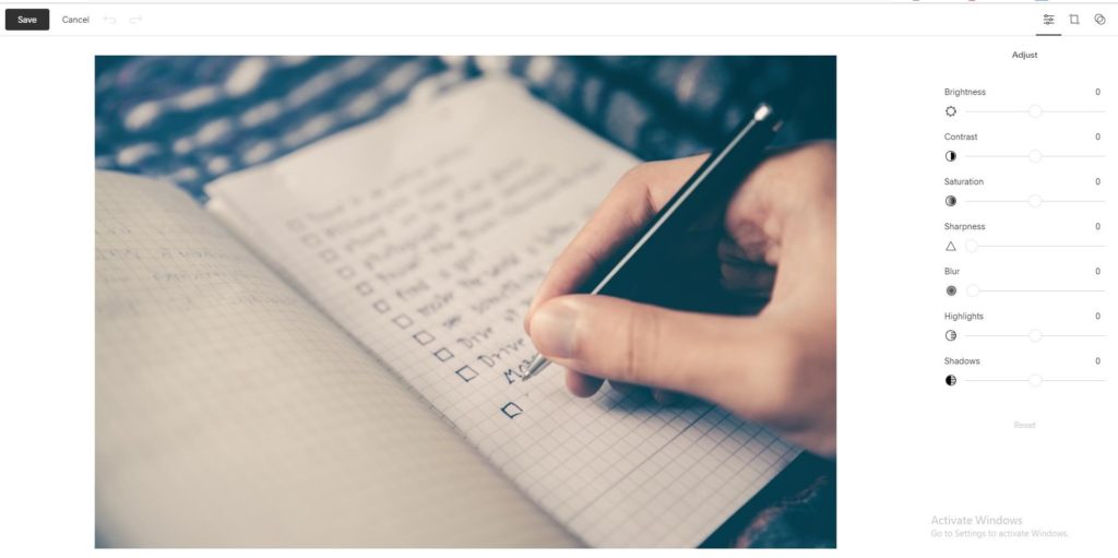
By the way, the image above should appear as a banner picture on the About me page. Although the image was uploaded and saved successfully, it didn’t appear where it should. So, it is a glitch #2.
Glitch #3 is the mal-synchronization of navigation. I’ve changed the number and position of pages, but the navigation panel on the website displayed it only after several refreshments. The navigation in the footer didn’t change at all, and I tried to edit it manually. It turned out that the process of applying the changes in navigation is challenging. You have to make a hyperlink so the navigation works as it should. Thus, you have to look through the settings of each page to find out what address it will have when the website is published. Then you should enter the copied address to the settings of the hyperlink.
Squarespace’s Dashboard
There are 8 sections of the dashboard:
Pages. This section provides access to the settings connected to the pages. There you can add meta descriptions and social sharing image to the page, etc. What I find useful, is a capability to review and restore deleted pages ( I had to use it a couple of times).
Design. It is possible to adjust the settings of every line and button, change the color and size of the fonts, but, still no possibility to change the typography of the template. What’s interesting, you can protect the pages with help of the password and lock them, so only those users who have the password can access it. Also, here you can edit the view of a “404” page.
Commerce. It is a premium feature that helps you to manage the online shop. I was quite interested in the Apps section presented there. Some builders offer hundreds of third-party applications to boost the level of the site. Here there are only three applications that can help you with your business and one of them operates only in Canada and the USA.
Marketing. There you can launch an email campaign, and the builder has several plans of campaigns to choose from. Also, Squarespace can help you to promote the products over social media.
Analytics. This self-explanatory section offers all kinds of information necessary to evaluate the efficiency of the website. What’s great, you can check the analytics on the go with the help of the mobile application.
Comments. This section operates approved, unmoderated and flagged comments that the visitors make on the website. Honestly speaking, I haven’t seen such a section at any previous builders.
Settings. Here you can work out all the details of your site, from the linked accounts to cookies. And there is a chance to be promoted by Squarespace and, as a result, attract more traffic to the site.
Help. It turns out that Squarespace has webinars and even an entire database of articles and videos about the possibilities of the builder.
To check the view of the website in the mobile and tablet mode I searched the whole Settings section as well as looked through the other sections of the dashboard. However, it was hiding under a 1 sm long line at the top of the page. I thought that it is an element of the design. Still, the site looks great on both mobile and tablet form, so no complaints there. After an hour of the manual editing of the Wix’s mobile version of the website, I favor any builder with automated creation of the mobile version of the site, to be honest.
Aaand here comes the fun part: it is not possible to publish the site during the trial plan, although this site utilizes no premium features. Keeping in mind five free already published sites, I find this situation quite frustrating.
To sum up:
Here is the main page of the freshly created and unpublished website pro se. I cannot say that I am fully satisfied with the result, still, I’ve seen much more primitive and rough-hewn websites than this one.
The template of the website is strange. Usually, it is a draft with prompts that suggest what should you write in the specified text form. Here instead you have an impression that the developers of Squarespace took a common website based on the offered blocks and simply provided access to its admin panel.
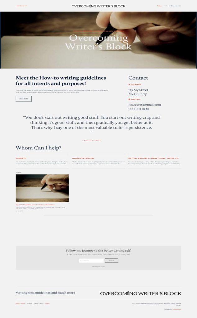
There are not that many templates or variants of blocks so it leaves no scopes for imagination or a chance to make the template more customized. And the failure in publishing the website for free puts a negative spin on the whole builder.
Still, there are features and tools that all other website builders should embrace. For example, the possibility to select the favorite templates or to look through the completed websites is a must-have for any builder.
Overall, I cannot say that the work with Squarespace was easy as ABC, still, with some time and scrutiny, a novice will be able to handle it. The builder limits a stretch of the imagination to some extent, but, in the case, if a newbie creates the site, it is an advantage. I find this builder a bit inconvenient as some tools and features are important but hidden from the view.
Day 2. Shopify
A quite unexpected choice for a person who does not want to sell her works via an online shop, isn’t it? My decision was based on the fact that it is: A website builder
- A website builder
- It does not require knowledge of a coding language
- It has a free trial version
The work with Shopify started unusually. Instead of answering several questions about the name of the site or its specialization I had to provide the information about my physical address and the volume of my business. And the first thing I saw after answering all those questions was a panel for adding a new product to the site. I guess this is the best exponent of the specialization of the website builder.
Shopify provides a template right off the bat, however, you can select another one from the list of ten templates available. You cannot look through the templates as you can see only a top of the main page as a screenshot.
I browsed through the Help section just as a matter of interest. It turns out that Shopify has one of the most extended Help centers for users. Each article provides a detailed step-by-step guideline with YouTube video instruction. Too bad, that this center offers an overwhelming amount of information about themes and how to customize them, as I am already scared of the unfamiliar tools and the view of the template. Add here theme documentation that any user should read before customizing the theme and the situation becomes even more stressful. When I was searching for the possibility to select a new template, I found a welcoming blog post with a statement that Shopify enables selling products within minutes from scratch. Sounds too good to be true, especially in the context of the unfamiliar tools and a task to turn an e-commerce template into a personal website.
Still, what the eye fears, the hands do.
Transforming online shop into a personal site
Believe it or not, but I started by adding a new blog post for the web site. At least, this is the only familiar thing in the website building that I can find here so far. The text editor here is, perhaps, the most functional in comparison with all previous builders. And this is a pleasant surprise, taking into consideration that Shopify focuses on the online shops.
Once you get used to the necessity of editing content in the left toolbar instead of trying to edit the text or image on the page itself, the process accelerates.
The template is tooled for online shop, that is obvious. Thus, here much prominence is given to the arrangement of products and collections. It is possible to arrange products into collections, add products to the collections automatically if they match the conditions and so on. For example, you can add a featured product to the main page. So, it will appear with a large scale image and detailed description there. The process of adding a new product merits detailed consideration. I remember the product sections at other website builders but nowhere else you have to provide so many details about the products as in Shopify. Apart from the price and description you can specify the inventory of the product, determine the inventory policy and terms of shipping. You can also add variants of the product instead of duplicating it.
Meeting glitches
And here comes the trouble. I have to admit, I am spoiled by the autosave of all changes made to the template that is present in all the previous website builders. All, except Shopify. Can you imagine how angry I was when I decided to add a collection to the website and all the changes made to the template disappeared? I am still fuming as I wasted more than an hour. Of course, I cannot name this incident a glitch, as it is a result of my inattention. The Undo button was useless in that case as the addition of a new collection asked for the changes in the menu (I still cannot find out what menu it was). And I was notified that those changes may erase all unsaved adjustments to the template and I agreed, though, I didn’t expect that it would be everything on the site.
The second glitch that is, once again, not a glitch but rather my incomprehension of the Shopify’s heredity. Such online shops are intended to be one-pagers, so there is a possibility to add a new page, but the functionality of this page shrinks to zero. I tried to add About page, however, you cannot add any new block to it and it will look like this:
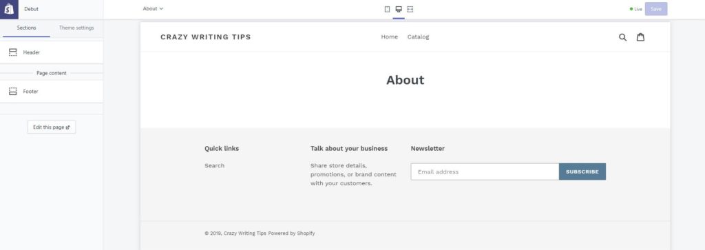
When you click on the Edit this page button, you get access to the text editor, and that’s all. As a result, you can place a text with an image or a table, and do not expect something more than that.
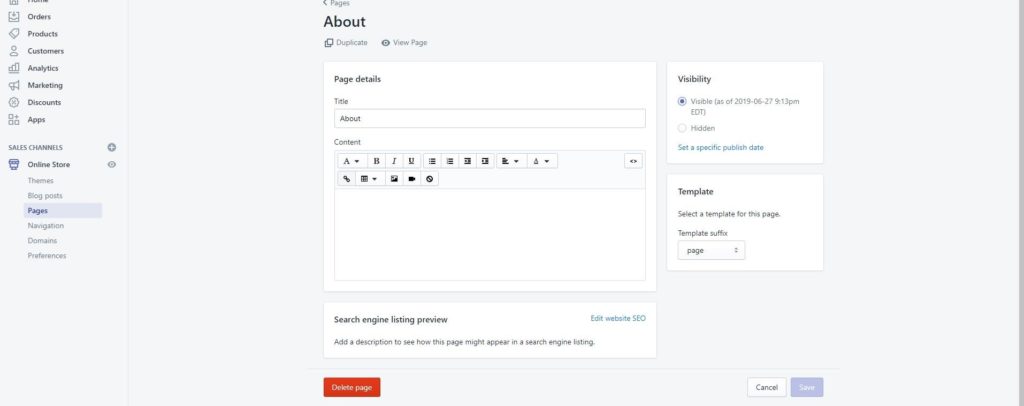
As a result, I stuffed all the necessary blocks on the main page. More than that, the About page does not reflect in the navigation of the site, you can visit this page only through the admin panel.
At the moment I cannot find a Contact block, so, I guess, I will have to use a text with an image to provide necessary information on how to get in touch with me. Also, I cannot add a file with my resume, and that’s disappointing.
Shopify’s dashboard
It creates an impression of the admin panel of the online shop rather than a dashboard of a website builder. All attention is focused on the products, purchases and everything that is connected to them. Perhaps, the only sections that cater to the website building are Home and Apps sections, and then Apps concentrate on selling more than on the website building.
Home. Here you can add a new product (with the highest priority in comparison with customization of the theme), edit the theme or add a domain. Also, here you can find a lot of prompts and helpful materials that guide you through the work with the site.
Orders. This section works with the orders, obviously. You can look through the orders, check drafts and observe abandoned checkouts.
Products. There are five subsections:
- All products
- Transfers
- Inventory
- Collections
- Gift cards
The idea of adding a gift card to my website seemed interesting to me at first, but, I sell nothing, so what to present in a gift card? So, I had to abandon this idea, as, what is more, adding gift cards requires Advanced Shopify plan.
Customers. Here the information about customers is accumulated, so you can look through the purchase history of every customer of your shop.
Analytics. I guess I’ve seen such comprehensive analytics only on the sites of stock exchanges before I met Shopify. There are 16 dashboards, 8 types of reports, Live View that allows monitoring the customers’ behavior on the site online.
Marketing. This section allows to launch marketing campaigns and offers some efficient tools to promote the store with the help of adds and emails.
Discounts. You can choose between discount codes and automated discounts.
Apps. I had high hopes on this section as I remember the contents of Wix’s app market and how such apps boost the extremely limited functional of Weebly. No miracle happened. All the applications offered on the app market here are focused on products, marketing, and analytics.
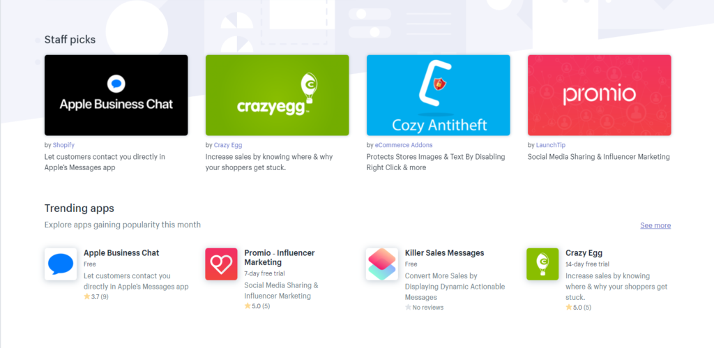
Sales channels. If you want to find a new sales channel (Facebook, eBay, Amazon, Instagram, etc.) then this section is the place you were looking for.
Online store. This section provides access to your online shop and here you can add new blog posts.
All settings that are usually situated in the dashboard and allow you to change the design of the template are situated in the theme itself in the Theme settings. Thus, you can select the most appropriate fonts and sizes of headings, colors of buttons and texts, insert links to social media, select a favicon or work out the design of the checkout.
On that score, Shopify breaks the mold as all other website builders contain all tools and features needed for the successful creation of the site in the dashboard. Naturally, here much prominence is given to what is on sale rather than to the design of the online store. Still, some crucial blocks are not available, for example, the template has no built-in Contacts block and there is no possibility to add such block, so you have to create a custom form.
To sum up
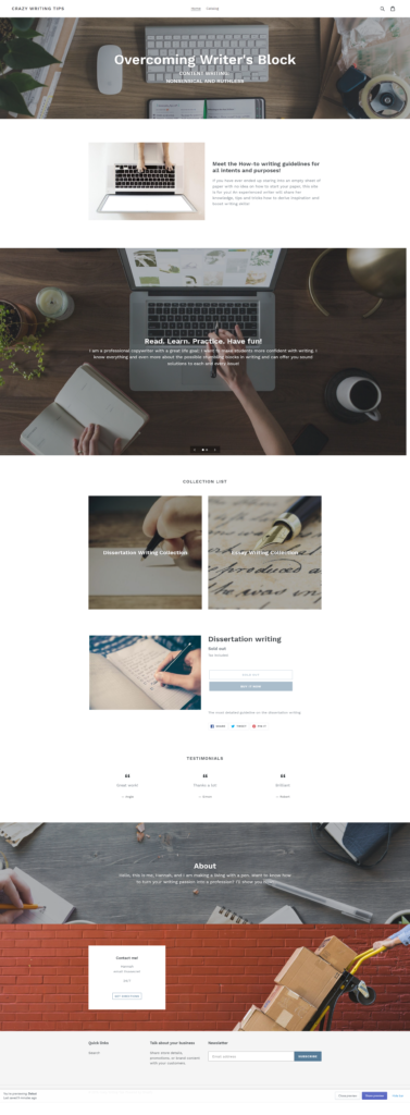
The site created here during the trial period cannot be published. Still, there is a possibility to save the site for the reviewing purposes, so, I guess, I will return to Shopify several times to refresh my impressions.
Once again, I have an ambivalent opinion about this website builder. I cannot say that I dislike it, neither I am totally happy with it and with the result. Yes, I’ve managed to transform a template for the online shop into a kind of personal website, however, I used 30% of the possibilities of Shopify in the best-case scenario. All advanced features that are offered here refer to products and sales, so I could not get the most out of this web builder. But, if you are an owner of a small business, trust me, you will find everything and even more to sell your goods efficiently.
Over and above, I cannot say that working with Shopify was inconvenient, as it was rather unusual in comparison with the previous builders. It was apparent and user-friendly, so any novice can handle it.
Day 3. BigCommerce
The experience with Shopify has shown me that it is possible to create a personal/blog website based on the online shop template. So the decision to try and test BigCommerce was deliberate and expected. And how wrong I was!
Honestly speaking, the idea of remaking an online shop into a personal website using BigCommerce supposed to be successful by no stretch of the imagination. Even Wix compares poorly with BigCommerce in terms of the inconvenience of using.
I took strides to make my review more organized but I gave up. I am so pissed off that I’m afraid that the text will look like a stream of consciousness. Sorry about that.
I cannot say that I am a child prodigy in the sphere of IT, but, I am not a technobimbo either. After all, I’ve managed to create seven websites using seven different website builders, so I’m not hopeless. But BigCommerce is my real chance to fall flat on my face. All my attempts to do at least something end up as a disaster. Although the left-side toolbar of the builder creates an impression of a fully-fledged kit, when you start looking through it, you understand immediately that you can change nothing. I mean, who cares about the color of the button or background color of the footer navigation?
I understand that, for the most part, my grudge stems from the fact that I do not need an online shop while working with a website builder that specializes in online shops. Still, it gets past me, why such sector-specific builders neglect the necessity of making a great informative website. It will not just sell goods but also provide useful information about the company to the customers, what’s not to love?
Everything starts from the dashboard of the builder. I would call it novice-friendly under no circumstances. At first, you have a queer feeling as if you are looking at the controlling unit of the atomic submarine. Then you start to see the familiar tools and sections, but, as with Shopify, the tools for site building are hidden under the tools necessary for e-commerce. Without a doubt, any business owner will find these tools important. But, why not to make a separate admin panel that will file out all the products, orders, information about customers, and so on?
BigCommerce offers only ten free templates, and neither of them is text-oriented. On the one hand, the process of making a choice is simplified as you can check the main characteristics and possibilities of the template. On the other, you are in despair as you see clearly that no themes meet your requirements and it seem almost impossible to complete your task. As for me, I had to select a template that is created for small catalogs.
Struggles with editing or Don’t try this at home
Seriously, people, are you calling it a drag-and-drop website builder? The only thing that can be drag-and-dropped here is a file with a picture from the computer to the upload area of the builder. (Me from the future: I found another drag-and-drop feature! You can drag and drop the icon of the social media platform from the list to the area in the Settings. Yeah, that’s much better. /Where is my Sarcasm sign?/).
I doubt that there is another builder that is as much user-unfriendly than BigCommerse. Some parts of the template can be edited using the dashboard on the main page of the builder. Other parts cannot be edited at all. And I still cannot find a possibility to add at least something to the main page of the site. You cannot change the position of the title or the navigation menu, cannot add a new block or change the font size. All you can do is change the color of the font and select one of eight fonts available.
I’ve managed to change the title of the store, add blog posts and two images to the “Home Carousel”.
Home Carousel deserves a couple more words.It is a slider where you can add up to 5 slides with text. It is impossible to change the image without deleting the whole slide. The preview of the carousel differs from the actual slider a lot. It made me nervous as I spent quite a long time trying to find the picture that would not be cropped from the sides. Then I’ve read the Help article that explained the reasons why the images look different in the preview and on the storefront. (I should do that earlier, my bad). Still, there was a problem with the width of the slider that cropped the top and bottom of any images. I went to that article again searching for the solution to that issue. And voila
It is possible to adjust the default dimensions of a carousel by editing a theme’s code ©.
BigCommerce
Brilliant. So, now I have to dig into the code of the template and still get nothing in the result because I know no coding languages. It seems that I will have to stomach those crops because this carousel is the only possibility to stuff at least some information about my works or working experience.
I had no chance to upload a file with my resume. Else, I would add it as a product and sell it to potential clients or employers. And what? I guess it might be funny (No).
The attempt to add “About me” page was a failure. I created a new page, added a text and an image there and that’s all. I am sure that I have squeezed the most out of the functionality of the pages that are not prescribed by the template.
When I saw the interface of this section for the first time, it was like a blast from the past. Honestly, is it a Microsoft Office 2003 window or I am seeing things?
Ok, I made a little research: the platform was found in 2009 and is considered to be “a leading platform… with advanced customization framework”. What I see now, is an outdated interface that didn’t change for years and a customization framework that disables any customization. The only thing that can justify it is that everything is focused on more efficient selling and presentation of the products.

Apart from the blog section, I managed to edit the Contact Us page. It was more or less easy as, in fact, here you have to customize a contact form ticking the boxes. Thus, you can shift from the most detailed form that takes into consideration the number of the order and the name of the company to the plain and simple form that asks for an email and name only. Advanced options deal with SEO settings of the page and imitate the ability to change the page layout file. Even if you want to do so, there is only one variant in the pop-down menu. Here the impossibility to add a new block perceives to the extreme. For example, I would like to add a map with a pinpoint of my physical location, but, there is none.
I made every reasonable effort to reframe the template to make it more personal-looking, and I must admit that I failed. However, when I tried to add a product just as a matter of interest I was impressed by the attention to the details. It seems that I was trying to make a house using the details of a wagon peddler.
The bright side of BigCommerce
I bet all the features that I find disadvantageous may seem a real advantage to any busy owner of a shop or service. Who would pay attention to the inability of adding long reads to the website that is supposed to sell goods? At long last, one can use a blog for it, right?
Here much prominence is given to the details of the products, brands, selling channels, etc. I have neither experience nor the interest in commerce so I cannot evaluate it from the professional point of view. Still, the amount of specific information that you can provide about the product bedazzles. I would spend a whole day describing the Products tool, so I better leave the screenshot here so you can understand its scale.

This is the main reason why BigCommerce is so highly appraised among entrepreneurs. I suppose they can forgive any glitch or inconvenience that BigCommerce has for the possibility to provide that amount of information about their goods.
BigCommerce’s Dashboard
The Home section allows you to define settings of the payments, shipments, purchases, select and customize a theme and add a new product. Also, it offers the statistics of the store performance and orders.
Orders section gathers all information about the orders. Here it is possible to track the order, check its status (15 positions!) and monitor the usage of gift certificates.
Products. Well, you’ve seen what it takes to add a new product to the store. Apart from adding a product you can also adjust the category, brand, check the reviews, make price lists and so on.
Customers. Here you can view the list of customers, export and import the list of customers, make groups of customers and filter them.
Storefront. This is the main tool for site customization. Here you can change text, add or delete pages, define the content of a footer or create a home page carousel. There is a possibility to add a logo or favicon, yet, obviously, BigCommerce offers no special tools to create them on your own. What’s unusual, here you can edit the email templates or certificate templates. As a rule, such emails are created in the Marketing sections.
Marketing. If you want to create a banner or enable selling on eBay, you are on the spot.
Analytics. This is the place where you can find tons of tables and graphs. Overall, you can get a full picture of what is going on in your store, however, the design of some diagrams leaves much to be desired. For example, this one looks too plain and childish, isn’t it?
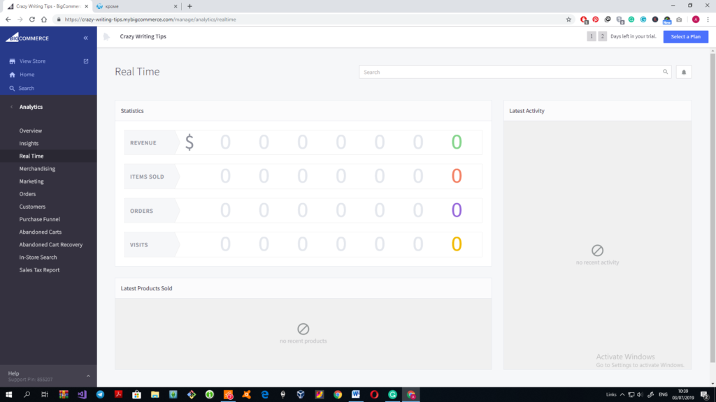
Channel Manager. Here you can set up new channels to promote and sell your products via different platforms. I like this section as here you get both explanations and tools on how to achieve the result. So, you don’t have to search for information and see clearly what is it and why you need it.
Apps. This section was not an eye-opener for me as many builders have an app market. However, one category of the apps and one app namely shocked me.
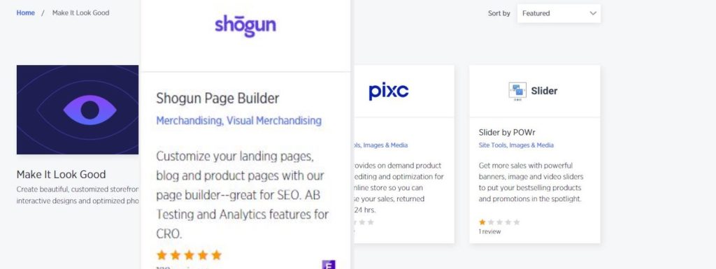
So, the website builder BigCommerce offers a third-party website builder to customize themes. The price of the subscription for 1 user/month is $69. Quite pricey for a feature that should be rolled out in the website builder by default, isn’t it? Besides, I’ve read the reviews of this app and users are not impressed, for the most part.
Although I hoped that the apps will help me to improve the quality of my design, it won’t work out. There are only three apps that work with the design of the templates and none of them are free or helpful. However, another five categories of apps can be useful for entrepreneurs who want to increase sales and traffic.
Store Setup section deals with different settings like shipping details or presents different tools that can be integrated into the store to simplify work with accounting.
Advanced Settings may look impressive at the first glaze. However, the work with them is limited by checking or unchecking one box.
Account Settings. Here you can look through users of the account, update or upgrade the account and look through the details of it.
Was it worth it?
The result of my work is soo cropped that there is no point of showing it, as I’ve managed to add nothing there. The main spotlight here is products and as I do not sell anything the pages look empty. I’ve added a couple of products and it is possible to find them using navigation, however, they didn’t appear on the main page, as I expected. And I have no idea how to place them on the main page.
Can I name BigCommerce a great website builder? Not in a million years. But ask this question to a business owner who needs an online shop and, I bet, you will hear chants of praises.
The possibilities of this builder are restricted within narrow limits and the possibilities to customize your site approach zero. However, when it comes to products, sales and everything that is connected to e-commerce, BigCommerce transforms. You cannot find a more detailed approach to the products rather than here. My main problem (as all the complaints connected to it) is based on the fact that I didn’t need an online shop and BigCommerce turned out to be too sector-specific to expect something more from it. So, if you need a well-rounded online shop, this builder is the best thing for you. But, if you want a fully-fledged website, forget about it.
A few words about the user-friendliness of the builder. It is very inconvenient. I can compare it with many other builders and it is one of the most difficult tools to work with.
Day 4. BoldGrid
After two days of struggle with e-commerce website builders, I’ve decided to rest up a bit. My designing ambitions craved for a builder that can fulfill my desires. My laziness asked for some plain and simple tools that won’t wreck my nerves.
BoldGrid seems to meet all my requirements. I don’t want to get stuck in the debris of WordPress, and yet, I am mesmerized with the possibilities that it offers. BoldGrid can be considered as a light version of WordPress designed for newbies, so, this is the very thing I am looking for.
The first glance
So far, so good, I like the start. No strange questions, no necessity to search for the post index of your city to start working with the templates (yes, I’m still fighting the flashbacks of dealing with online shop templates). Once you’ve logged in, you get access to the free templates. What did I tell about three hours limit of working with one builder? I can spend all these three hours browsing through the offered templates!
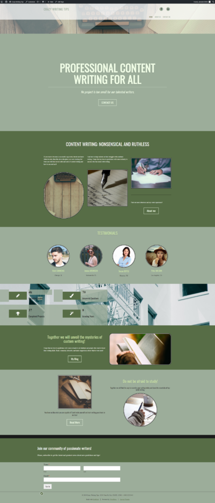
Believe it or not, but I found a couple of themes I can work with right off the bat, just after changing the text in them. They have everything I need and even more and look exactly like the perfect websites I was trying to create using other website builders.
Features and possibilities of the editing tools
At the moment I see one disadvantage: this builder is slow. Saving the changes takes quite a lot of time so you have to wait half a minute until one page loads on the screen. Bring into the notice, that I haven’t made any changes yet and my PC was bought as a gaming one. And what will happen when I upload some heavy-weight images or files to the template?
What I like from the start: BoldGrid justifies the name of the drag and drop builder to the max. Here you can change the position of the columns, titles, text areas as well as edit the text right on the page. You do not have to surf through all sections of the dashboard to make changes to the text. And there is no need to search for the hi-quality images that are theme-related and correspond the style of your theme as there is a great library of free media.
When you edit the content of the page, there is a general text editor at the top of the page. However, if you want to adjust the font, set up text effects or change the color, style and spacing there is an additional text editing tool. Mind, though, that the main image and title should be edited separately from the rest content. It is not that convenient, but bearable, especially if to compare it with some other website builders.
The process of adding a new block is as simple as ABC, however, most of the new blocks are Premium. Yet, the range of choices is wide and it is possible to find a free block with the necessary content. It’s another matter that free blocks do not match the style of the template so you will have to adjust it manually.
There are 16 types of blocks in 14 categories. And each category offers at least 20 blocks of each type. However, after careful examination, it becomes clear that some blocks repeat in the list and sometimes blocks appear in wrong types. For example, I searched for a great blog section and counted at least five About us blocks in the offered list. It would be more helpful if the blocks were categorized more strictly. Of course, the number of blocks would decrease, but, the work with them would be much easier and take less time.
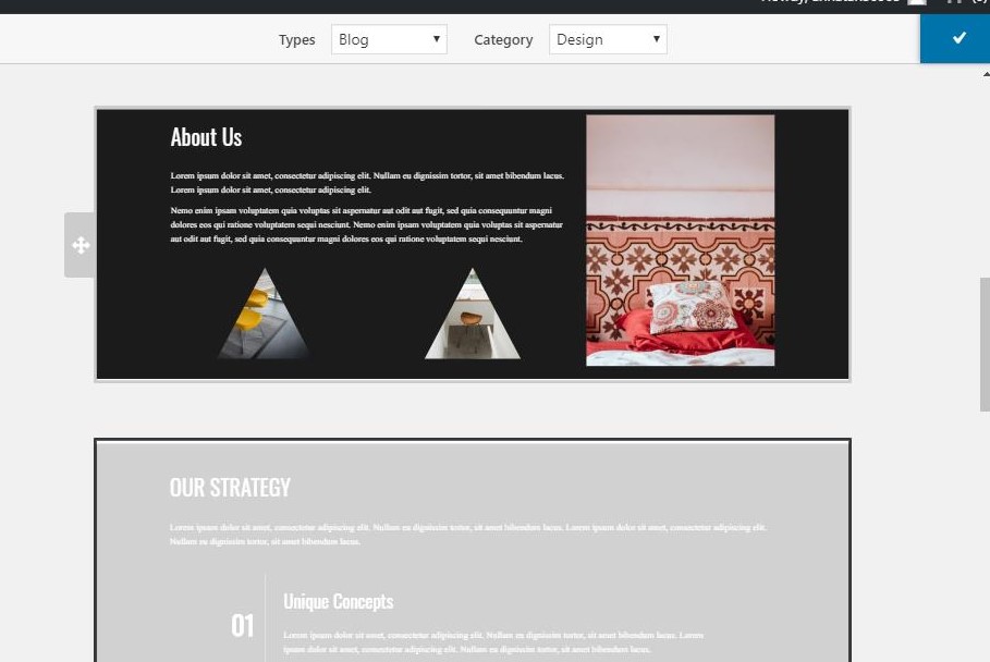
What’s interesting, the first blocks that you see in the list of offerings match the style of the chosen template making the process of selection much easier and quicker.
The blog section left an ambivalent feeling. Usually, when you add a new post, you work with a text editor, but here you can add a block right into the blog post. What for? Any good article requires a great text and an image for the presentation, that’s all. By the way, the functionality of the blogs leaves a room for improvement. Thus, you cannot share it over social media or like/dislike it.
Another disappointment connected to the blogs here is that the added Blog block does not connect to the blog posts that I have already published using this template. I had to delete the Blog block from the main page as I haven’t find the way to make a preview of the posted blog post. And that was the block that was made to preview the articles from the blog section, so it didn’t work as it should.
“Easy SEO”
This is one of the features that I admire as it is newbie-friendly. It prompts the user how to improve the page and thus make it more successful in terms of SEO. Not all builders dedicate that much attention to SEO, so this is a definite advantage of BoldGrid.

Strengths and weaknesses of BoldGrid
The work on the other pages revealed more pros and cons of this builder. When working with About page I tried to find a way to upload a file with my resume. It took more time than I expected, yet, I managed to edit the button so it opens my resume in a new tab. I am not talking about the possibility to upload a file from the site (and many less fully-fledged builders have this feature).
I’ve found some cool blocks like infographics and choose some that correspond to the style of the template. It is possible to change the width and height of the blocks safely by changing the dimensions of the rows between blocks.
One weird thing is the BoldGrid currency. It seems that the BitCoin madness has touched this builder too. At first, I have noticed the cart with added purchases at the top of the page. I thought that I added Premium blocks without knowing and the cart shows that I will have to purchase them. But it turned out that the template itself uses several images that can be bought via BoldGrid coins. What’s interesting, I cannot say that these images differ from the images from the free media library, so what’s the point?
Meeting glitches
As I’ve said before, working with BoldGrid resembles slow-mo. When you write a new text or look through the available blocks to work with, everything is fine. But when you add a block to the page or save the changes to the page, be prepared to wait.
Another problem I faced was the disappearance of some sections. Sometimes when I looked through the page that I was editing, not all blocks were displayed. After I updated the changes made to the template the missing block returned.
Glitch #3. The changes I’ve made to the header of the home page didn’t save. I had to redo them and save the whole draft once more.
Glitch#4. The whole Blog page disappeared, though, I haven’t done anything to delete it. There is a published post, I can view it through the dashboard, yet, there is no such page in the navigation. I tried to add the new page but I have no idea how to set up connections between this page and new blogs.
Glitch#5. I cannot find any Publish feature/tool/button. There is a link for previewing the site but I cannot publish it completely. I assume that I will be able to do so once I switch to premium or buy a subscription. Or, I missed it somewhere, that happens.
BoldGrid’s dashboard
Overall, those people who have ever seen the WordPress dashboard will understand how to work with BoldGrid.
“Home” is a welcome section with a lot of reference materials about the builder and tools.
The next is the Updates section that allows you to create a backup file for the site and update the used plugins.
Inspirations section is the section where all your work starts from. Here you can choose the template, check the list of pages and start editing them. Besides, there is a Support subsection that offers links to the tutorials, user groups and one-on-one consultations.
Media section collects all the images and files that are used in the template.
Blog Posts is the section where you can add and manage articles for the Blog page of the template. To be blunt, I still do not understand the necessity of separating the blog articles into the dashboard. Many builders provide it as a block and it works perfectly.
Plugins section informs about all plugins that are used in the template and enables their update.
Users. Here you can edit the information in your profile and add manage users’ accounts.
Tools. This section can be really helpful for newbies. Apart from pointing out what tools are used in the templates, there is one useful subsection called Site Health. Here you can find prompts on how to improve the site
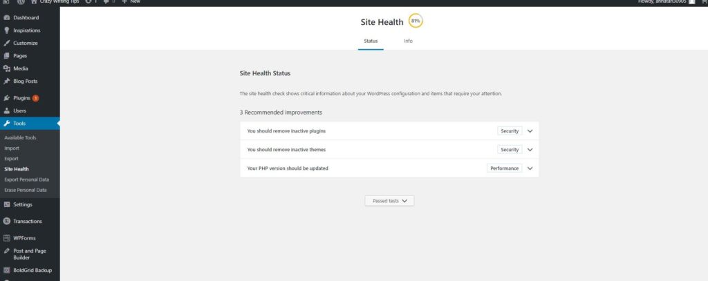
Settings. Here you can find all types of settings, from the general ones to the most specific.
Transactions. I have mentioned that ridiculous BoldGrid coins. In this section, you can purchase coins, see the transaction history and look through your cart.
WPForms. Perhaps, it would be a cool section if I could understand how to add those forms to the site. I have to admit that I haven’t seen this section for quite a long time so I tried to create one of such forms on my own. And I even wrote a virulent comment about the absence of the crucial forms! Still, it would be much more convenient if the samples of such forms appeared in the blocks.
Post and Page Builder. I cannot understand this form, to put crudely. And something tells me that it is better not to mess with the settings that I don’t understand:) As, for example, I have clicked a couple of boxes somewhere in the Blogs section and now I cannot replace the posted blog that shows up instead of the home page.
BoldGrid Backup. Here you can look through the saved backup files of the sites and check the “preflight list” to ensure that everything is ready for publishing.
To sum up
It seems that I have found another favorite that puts competitive pressure on Wix. BoldGrid is relatively easy to use, offers a wide range of possibilities and does not limit the freedom of a novice developer. Still, even with this freedom, you are able not to spoil the template as it already has a lot of features and necessary blocks.
I have to confess, I spent much more than three hours building this site. But, it is not because it was challenging or too difficult to work with. I liked it and I was drawn into the template. It was interesting to dig into the details of the template and find out what else does this template can do. (Luckily for me, there is no possibility to bolt on an online shop to the template).
Some things call for improvement. I don’t know how to fix some mistakes that I’ve made here. Still, it was fun, it was interesting and I will return to this builder.
Day 5. Gator by HostGator
They say leave well enough alone. But, a thought struck me: I tried and tested only free versions of the website builders. Who knows, maybe there are builders that have advanced features and require relatively small fees.
My choice fell on Gator by HostGator, mainly because of the title “simple drag and drop builder” and a price $4.99 per month (taking into consideration 50% discount). Well, I hope my sacrifice will not be in vain.
After you make a purchase (I still need some explanations about the domain fee that will not be returned in case of the cancellation of the subscription) you are transferred to the Dashboard where you can start working with your template.
I have to admit that I spent quite a lot of time selecting the best template. There are 22 categories of templates to choose from so I had a wide range of choices. Of course, I found a lot of plain and simple blog templates that I could use for the site. However, my greediness gave me no chances but to select one of the original templates.
The tools and possibilities of Gator
Uhm… What’s this?

I started to customize the theme and now I have to guess what tool or feature is hiding under each square. That will slow me down, so, obviously, I do not like it already. After an hour or so the icons returned to their natural state, yet, they have already wrecked my nerves.
I have a strange feeling about this builder. It allows you to customize everything in the template, change the images, change the positions, fonts, sizes, even add animations and different effects to the texts. Still, as a novice, I find it a bit overwhelming. There are several places where you can adjust settings of the sections. It is new to the sight and you have to come to terms with the builder before you start using it with confidence. As for me, I still cannot say that I have caught the trick and now can use Gator with ease.
You can add new elements using two tools and one of the tools has two tabs. The contents of these tools differ so it takes some time to figure out where is the necessary element or section that you want to add.
Usually, I prefer not to edit the settings that I do not understand or that seem too complicated to me. However, here I have found a tool to play with. Here you can apply animation to anything and I am trying to restrain my temper limit myself by only one animated element on the page.
There are 15 types of elements, 8 content sections and 8 common sections that you can add to the page. There are only a few builders that can outperform Gator in this field. More than that, it is possible to change the design of the common sections and usually, the builder offers more than 20 variants to choose from. And I have to admit that there are many elaborate designs with a lot of built-in forms and features. However, many essential forms, like newsletter form appear to be in one design that you have to adjust to the style of your theme. And compare it with GoDaddy, for example, that offers at least 5 newsletter forms of all shapes and sizes, presented in a block.
The Blog section is also allocated in a separate section and the page for it is created separately. The text editor didn’t impress me much as well as the functionality of the blog. You cannot share it over social media, or leave a comment, or evaluate it somehow. Well, I cannot say that I am impressed with the level of blogs here, and, taking into consideration, that this builder does not offer a trial version, it is a huge disappointment. After all, the whole point of making a website was my wish to share my knowledge in the writing sphere. And here I even cannot get feedback from the readers because the Blog section has no comment block.
Another surprise: you cannot add a file so anyone can download it from the site. Or, you can, but you have to upgrade it to a more expensive version. It reminded me of a “free” Calculator app that offered the customers to purchase a button “+”, to put crudely.
Gator is the second builder that offers a possibility to add Flash objects to the page. Once again, many browsers disable Flash because it can compromise the protection of the data. Is it that necessary to use it and if I add it what impact will it have on the ranking of the site?
I’ve also checked how this site will look like in the mobile version. Thank you, developers, that there is no need to adapt as everything looks fine and needs no interference.
Meeting glitches
The first “square” issue was not the only problem that I faced during the work with Gator. There were a couple more issues caused by my inattentiveness, so that does not count.
Gator is faster and, for the most part, more well-rounded, in comparison with other builders. And that is one of the advantages of it.
Gator’s dashboard
Once again, if to compare Gator with other builders, it becomes clear that here the dashboard is rather scanty. You won’t find here tools for editing the site contents, as you customize everything directly on the site. As for me, it is much more convenient than the necessity to jop-hop from the dashboard to the site and back again to edit thу title in a header.
My sites section provides a list of the customized sites, overall statistics, recommended apps and the latest news of the platform.
Domains allow you to manage domains of the sites. You can buy a new one or connect a domain that you have already bought elsewhere.
Email section offers a possibility to purchase Google G Suite for your business that allows you to make a business mail with your @domainname.
Contact List creates a list of the emails provided by your subscribers.
App Market. I was expecting something more. Can you name a place where only 5 apps are presented as a market? It is a vending table at its best. More than that, all the apps are available for Premium users only.
My account. Here my personal and financial information is stored, so, I hope, it is protected safely.
Support. It is a “Knowledge base” with 8 categories of articles and a possibility to send a message to the Support team.
And that’s all. Am I disappointed with this dashboard? Truth be told, yes. Where is my Analytics with at least six graphs and tables? How can one graph with 4 columns provide all the necessary information about the current situation on my website? A complete newbie will be more than happy with it…for the first month. But then you start to evolve as an owner of the website and want to know more about its success and efficiency. If Gator was my first builder I would be totally happy with the availability of this one graph. But this is my tenth builder, I know the capabilities of the builders and now I want more.
When I published the site and tried to look through the stats built-in to the site itself, I was sent to purchase a Premium account to see the statistics. Thank you very much, but no.
A couple more words about SEO. There is none. I didn’t find the places where to add a page description. There is a SEO section in the editing toolkit, however, when I opened it, there were no features or forms to fill in.
Where is the Marketing section? That Contact list can replace it? Of course, there is a pretty good chance that the Premium users have it somewhere as there is a possibility to add a shop to the site. But I have only a Starter account and I do not need Premium one. Maybe, all marketing features are conducted through the apps, but, once again, you need Premium to install those apps to the site.
To sum up
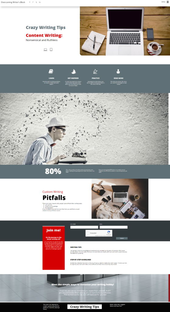
I cannot say that I am disappointed with the result of my work. Gator offers quite a lot of features that are easy to use and make the site look more unique and elaborate (animation alone counts for a lot!). And, overall, most of the templates look really well-thought-out and fully-fledged. Gator gives a lot of freedom of actions and decisions, and if to use them wisely, you can create a site that will never resemble a site that was made out of the common template.
This site looks much better than many other sites that I’ve made using different builders. And it is not because I am a novice anymore (this was my first work with Gator, mind that), but because of the forethought of the template and that I didn’t make changes to the color scheme and typography of the template.
However, do not forget that Gator is one of the few builders that does not offer a trial version of the builder. So, there should be a Wow-factor somewhere that would entrust the customers that they’ve made the right decision and there’s no need to ask for a money refund. There wasn’t such Wow factor for mу and I do not see in what way is Gator better than many other solid builders.
Also, some weak spots desperately call for improvement.
Would I recommend this builder to my friends? Maybe. It is on the list of my favorites. A novice can work with it easily without getting involved in the maze. And as your experience grows you can add new details that require more customization and attention.
Is this the end of the journey?
After working with these five builders the main thought that I bear in mind for the third day in a row: do not try to remake a personal website out of the online store. It’s like mixing apples with oranges, you can do it, but why for (unless you want to create the online shop, of course)? There are many other website builders with great templates and tools.
Conclusion #2. Pro companies are not above free templates taken from free website builders. So, even if you order a custom website, there is no guarantee that you won’t receive a customized free template for a large amount of money.
In my rating these five builders receive these rankings:
5. BigCommerce
4. Shopify
3. Squarespace
2. Gator
1. BoldGrid
It sounds a bit biased, I know. But, in the case with BigCommerce, I still do not understand why it is impossible to dedicate a tenth of attention from the commercial tools to site building kit. No matter how brilliant and dedicated your shop is, it is like a gem without a chase.
Squarespace has too many glitches and limitations to be able to compete with the leaders of the rating.
And why BoldGrid and not Gator?
BoldGrid is a versatile, yet, user-friendly platform with attention to details. The range of choices impresses and, what’s my favorite, there is a lot of help for the newbies. “Easy SEO” is my new love! Gator, for instance, has no SEO assistance at all.
I believe I have proved that even a novice with zero knowledge of coding can create a good site within a short time and for free. I hope, my experience will be useful for others and will help to select the most appropriate and user-friendly builder. My search for the perfect builder is not over yet!
Stay tuned! And I am waiting for your suggestions on what else builders to test!


